Onboarding
The SDK provides 2 optional onboarding possibilities that will be shown to the user on first start with some default content. It can be disabled if you do not want to use it. You can also alter the contents of the onboarding to adapt it to your needs.
Full Screen View Pager
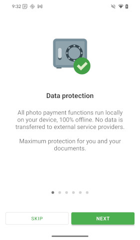
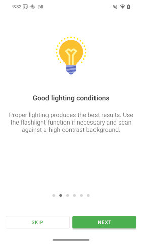
The first option provides a full screen view pager with swipeable content that opens once before the camera starts.
By default, this option is deactivated on the document scan and activated on the photo payment process.
Scan Hint Popup
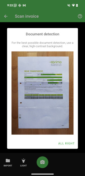
The second option is a popup on the scanning screen.
By default, this option is activated on document scan and on photo payment.
Customize
Button colors are configured by the global color configuration.
Button titles can be set from commonMain. Button icons and item images use platform-specific resources, so configure them in androidMain or iosMain.
Onboarding
You can use the onboarding option as part of the document scan or photo payment process to alter the default onboarding behaviour to your needs.
Currently the following values can be set:
| Property | Type | Description |
|---|---|---|
items | List<DocutainListItem>? | The items you want to show within the onboarding. If you don't provide any items, some default items will be displayed in case of photo payment. In case of document scan, onboarding won't be shown. |
buttonNext | DocutainButton | The button that goes to the next item. |
buttonFinish | DocutainButton | The button that closes the onboarding on the last item. |
buttonSkip | DocutainButton | The button to skip (close) the onboarding. |
buttonBack | DocutainButton? | The button that goes to the previous item. It is disabled by default. |
scanHintPopup | ScanHintPopup? | A popup that appears when scan is opened for the first time, explaining to the user how to scan. See ScanHintPopup for more details. |
You can use a selection of the SDK's default items. For example, to show only the first default onboarding page:
- Document Scan
- Photo Payment
val onboarding = Onboarding().apply {
    items = DocutainSdk.onboardingDefaultItems().take(1)
}

val scanConfig = DocumentScannerConfiguration().apply {
    this.onboarding = onboarding
}

val scope = rememberCoroutineScope()
scope.launch {
    val result = DocutainSdk.scanDocument(scanConfig)
}
val onboarding = Onboarding().apply {
    items = DocutainSdk.onboardingDefaultItemsPhotoPayment().take(1)
}

val photoPaymentConfig = PhotoPaymentConfiguration().apply {
    this.onboarding = onboarding
}

val scope = rememberCoroutineScope()
scope.launch {
    val result = DocutainSdk.startPhotoPayment(photoPaymentConfig)
}
The following sample alters the buttonNext title.
val onboarding = Onboarding().apply {
    items = DocutainSdk.onboardingDefaultItems()
    buttonNext.title = "my next"
}
val scanConfig = DocumentScannerConfiguration().apply {
    this.onboarding = onboarding
}
val scope = rememberCoroutineScope()
scope.launch {
    DocutainSdk.scanDocument(scanConfig)
}
The shared settings can be prepared in commonMain:
// commonMain
fun createScanConfigWithOnboarding() = DocumentScannerConfiguration().apply {
    onboarding = Onboarding().apply {
        buttonNext.title = "Next"
    }
}
Then add a complete custom onboarding item and change the next button icon on that configuration before starting the scan. Add drawables named custom_onboarding and custom_next to the Android module, or image sets with those names to the iOS app's asset catalog:
- androidMain
- iosMain
val scanConfig = createScanConfigWithOnboarding().apply {
    requireNotNull(onboarding).apply {
        items = listOf(
            DocutainListItem(R.drawable.custom_onboarding, "Get ready to scan", "Place the document on a flat surface.")
        )
        buttonNext.icon = R.drawable.custom_next
    }
}
val scope = rememberCoroutineScope()
scope.launch {
    DocutainSdk.scanDocument(scanConfig)
}
val scanConfig = createScanConfigWithOnboarding().apply {
    requireNotNull(onboarding).apply {
        items = listOf(
            DocutainListItem(image = "custom_onboarding", title = "Get ready to scan", message = "Place the document on a flat surface.")
        )
        buttonNext.icon = "custom_next"
    }
}
val scope = rememberCoroutineScope()
scope.launch {
    DocutainSdk.scanDocument(scanConfig)
}
ScanHintPopup
The following provides an overview of the currently available common options to alter the ScanHintPopup:
| Property | Type | Description |
|---|---|---|
title | String? | The text to display as title. |
message | String? | The text to display as message. |
closeButton | String? | The text of the close button. |
imageSource | Android drawable resource ID or iOS image asset name | The image shown in the popup. Set it in platform-specific code. |
The popup's text can be configured in commonMain, while its image is added later in platform code:
// commonMain
fun createScanConfigWithHint() = DocumentScannerConfiguration().apply {
    onboarding = Onboarding().apply {
        scanHintPopup = ScanHintPopup().apply {
            title = "Scan your document"
            message = "Hold the device steady and fit the full page into the frame."
            closeButton = "Got it"
        }
    }
}
Add a drawable named custom_scan_hint to the Android module or an image set with that name to the iOS app's asset catalog, then supplement the same configuration before starting the scan:
- androidMain
- iosMain
val scanConfig = createScanConfigWithHint().apply {
    requireNotNull(requireNotNull(onboarding).scanHintPopup).imageSource = R.drawable.custom_scan_hint
}
val scope = rememberCoroutineScope()
scope.launch {
    DocutainSdk.scanDocument(scanConfig)
}
val scanConfig = createScanConfigWithHint().apply {
    requireNotNull(requireNotNull(onboarding).scanHintPopup).imageSource = "custom_scan_hint"
}
val scope = rememberCoroutineScope()
scope.launch {
    DocutainSdk.scanDocument(scanConfig)
}
Disable
If you don't want to use either onboarding option, set the onboarding property to null.
- Document Scan
- Photo Payment
val scanConfig = DocumentScannerConfiguration().apply {
    onboarding = null
}
val scope = rememberCoroutineScope()
scope.launch {
    val result = DocutainSdk.scanDocument(scanConfig)
}
val photoPaymentConfig = PhotoPaymentConfiguration().apply {
    onboarding = null
}
val scope = rememberCoroutineScope()
scope.launch {
    val result = DocutainSdk.startPhotoPayment(photoPaymentConfig)
}
If you want to use the swipeable onboarding, but not the popup, set the scanHintPopup property to null.
val onboarding = Onboarding().apply {
    items = DocutainSdk.onboardingDefaultItems()
    scanHintPopup = null
}
val scanConfig = DocumentScannerConfiguration().apply {
    this.onboarding = onboarding
}
val scope = rememberCoroutineScope()
scope.launch {
    DocutainSdk.scanDocument(scanConfig)
}
If you want to use the popup for Photo Payment, but not the swipeable onboarding, set the items property to an empty list. For document scan, this is the default option.
val onboarding = Onboarding().apply {
    items = emptyList()
}
val photoPaymentConfig = PhotoPaymentConfiguration().apply {
    this.onboarding = onboarding
}
val scope = rememberCoroutineScope()
scope.launch {
    DocutainSdk.startPhotoPayment(photoPaymentConfig)
}
Reset
Both onboarding options are shown only once. If you want to show them again, you can use the resetOnboarding method. You can choose which one you want to reset:
DocutainSdk.resetOnboarding(
    onboarding = true,
    scanHintPopup = true
)