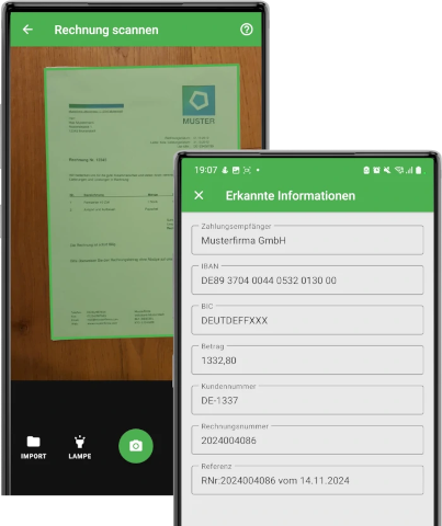
Photo Payment
With Docutain's Photo Payment SDK you can integrate photo payment into your app within minutes. It includes ready-to-use UI components that can be altered to your needs and coprorate design.
Data Protection
Invoices contain lots of private information that need to be protected. By using the Docutain Photo Payment SDK, you have chosen the only available solution that provides 100% data protection.
This is because all functionality, especially analyzing the document content to find the relevant payment information happens on device, 100% offline. Meaning, no data at all is transfered to any external server or cloud service.
This eliminates any data protection risk and makes the Docutain SDK the first choice.
Reliability
We all know that even the most reliable servers experience outages from time to time, which directly result in the inability to process photo payments for your users.
Since the Docutain SDK runs offline on the respective device, without any server connection, the functionality is 100% available.
Photo Payment
Initialization
- Follow the Getting started guide
- Initialize the Docutain SDK as described here
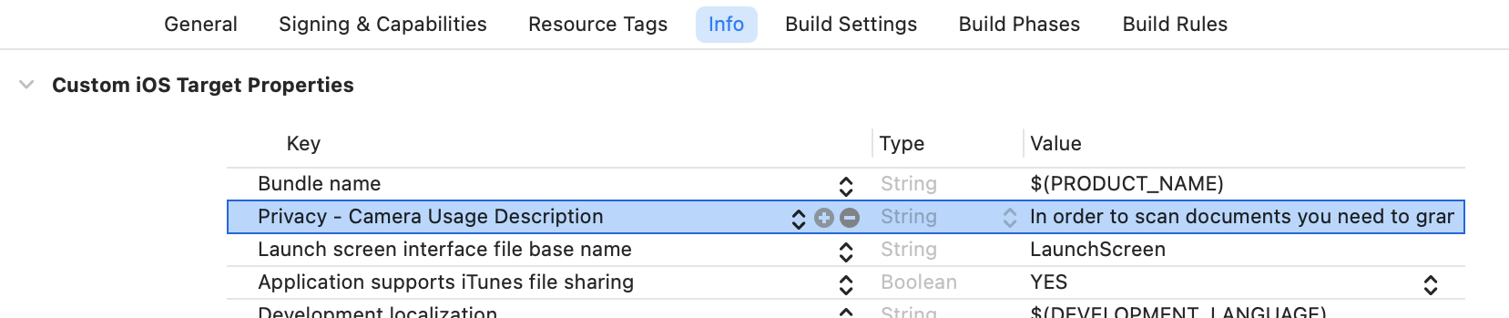
Camera Permission
You need to specify the reason for requesting access to the camera as part of the NSCameraUsageDescription in the Info.plist. If you don't the app will crash.
Start Photo Payment
To start the photo payment process you only have to implement our predefined PhotoPaymentDelegate, implement it's didFinishPhotoPayment method and call the static UI.startPhotoPayment method at the place you want to start the photo payment process, e.g. in a button click handler.
An instance of PhotoPaymentConfiguration is required to launch the process. It provides the possibility to change some behaviours and theming to adopt it to your needs.
See Change default scan behaviour for possible custom settings.
import DocutainSdk

class ViewController: UIViewController, PhotoPaymentDelegate {

    //...

    func didFinishPhotoPayment(paymentData: String?) {
        if let data = paymentData{
            if !data.isEmpty{
                // data is a JSON string containing the information
                // extract the fields you need and pass it on to your payment sheet
            } else{
                // no data was extracted at all
                // Note: this case is only reachable, if you disabled the Empty Result Screen
            }
        } else{
            // user canceled scan process
        }
    }

    @objc private func buttonClicked(){
        let paymentConfig = PhotoPaymentConfiguration()
        UI.startPhotoPayment(delegate: self, config: paymentConfig)
    }

    //...
}
Extract Payment Data
The payment data will be returned as JSON string. By default, it will have the following structure:
{
    "Address":
    {
        "Name1": "DB Fernverkehr AG",
        "Name2": "",
        "Name3": "",
        "Zipcode": "60643",
        "City": "Frankfurt am Main",
        "Street": "BahnCard-Service",
        "Phone": "0302970",
        "CustomerId": "",
        "Bank": [{"BIC": "PBNKDEFFXXX",
        "IBAN": "DE02100100100152517108"}]
    },
    "Date": "2024-10-14",
    "Amount": "244.00",
    "InvoiceId": "2023174086",
    "Reference": "RNr:2023174086 vom 14.10.2024",
    "SEPACreditor": "DB Vertrieb GmbH"
}
If you don't need it, you can disable reading the BIC:
@objc private func buttonClicked(){
    let paymentConfig = PhotoPaymentConfiguration()
    paymentConfig.analyzeConfig.readBIC = false
    UI.startPhotoPayment(delegate: self, config: paymentConfig)
}
Instead of a Bank element, the data will then only have an IBAN element:
{
    "Address":
    {
        "Name1": "DB Fernverkehr AG",
        "Name2": "",
        "Name3": "",
        "Zipcode": "60643",
        "City": "Frankfurt am Main",
        "Street": "BahnCard-Service",
        "Phone": "0302970",
        "CustomerId": "",
        "IBAN": ["DE76570928000208303503", "DE41510500150710030316"]
    },
    "Date": "2024-10-14",
    "Amount": "244.00",
    "InvoiceId": "2023174086",
    "Reference": "RNr:2023174086 vom 14.10.2024",
    "SEPACreditor": "DB Vertrieb GmbH"
}
Optionally, you can enable reading the payment state, telling you whether the invoice has already been marked as paid.
@objc private func buttonClicked(){
    let paymentConfig = PhotoPaymentConfiguration()
    paymentConfig.analyzeConfig.readPaymentState = true
    UI.startPhotoPayment(delegate: self, config: paymentConfig)
}
The payment data will then have an additional value PaymentState which contains either Paid or ToBePaid:
{
    "Address":
    {
        "Name1": "DB Fernverkehr AG",
        "Name2": "",
        "Name3": "",
        "Zipcode": "60643",
        "City": "Frankfurt am Main",
        "Street": "BahnCard-Service",
        "Phone": "0302970",
        "CustomerId": "",
        "Bank": [{"BIC": "PBNKDEFFXXX",
        "IBAN": "DE02100100100152517108"}]
    },
    "Date": "2024-10-14",
    "Amount": "244.00",
    "InvoiceId": "2023174086",
    "Reference": "RNr:2023174086 vom 14.10.2024",
    "PaymentState": "ToBePaid",
    "SEPACreditor": "DB Vertrieb GmbH"
}
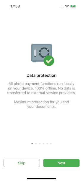
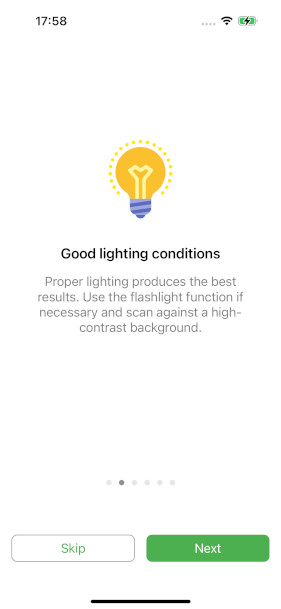
Onboarding
The SDK provides 2 optional onboarding possibilities that will be shown to the user on first start with some default content. You can customize it according to your needs or disable it completely.
See Onboarding for details.
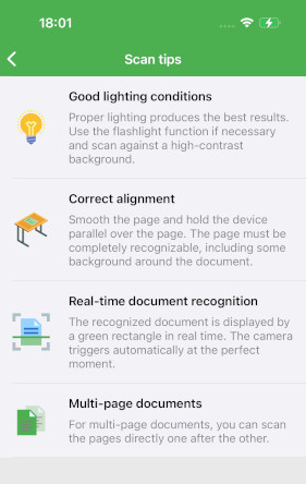
Scan Tips
The SDK provides an optional toolbar item within the scanning screen, that when clicked, will open some tips on how to get the best scan result. By default it is activated and shows some default items. You can customize it according to your needs or disable it completely.
See Scan Tips for details.
Empty Result Screen
By default, when no payment data could be extracted (meaning, no IBAN, no SEPACreditor, no Amount), the SDK provides a screen with some tips and an option to cancel or to retry the scan. You can customize it according to your needs or disable it completely.
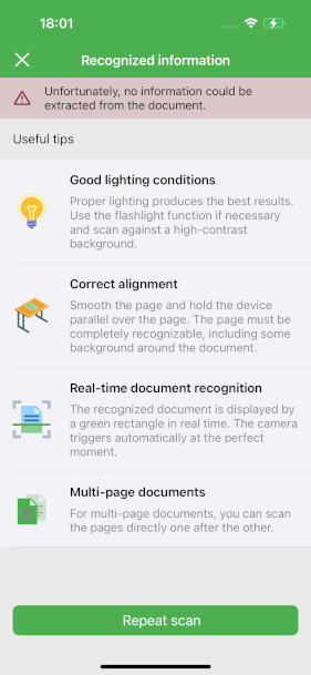
Disable
To disable the empty result screen, set the emptyResultScreen property of the PhotoPaymentConfiguration to nil:
@objc private func buttonClicked(){
    let paymentConfig = PhotoPaymentConfiguration()
    paymentConfig.emptyResultScreen = nil
    UI.startPhotoPayment(delegate: self, config: paymentConfig)
}
Customize
Button colors are configured by the global color configuration.
If you want to provide your own items instead of the default items, you can do that by providing your own list of DocutainListItem.
Each item consists of an image, a title and a message. image needs to be the name of an image in your assets catalog.
@objc private func buttonClicked(){
    let paymentConfig = PhotoPaymentConfiguration()
    let items = [DocutainListItem(image: "Image1", title: "Title1", message: "Message1"), DocutainListItem(image: "Image2", title: "Title2", message: "Message2")]
    paymentConfig.emptyResultScreen?.items = items
    UI.startPhotoPayment(delegate: self, config: paymentConfig)
}
The following provides an overview of the currently available options to alter the emptyResultScreen:
| Property | Type | Default Value | Description |
|---|---|---|---|
items | [DocutainListItem]? | EmptyResultScreen.defaultItems | The items you want to show as scan tips. If you don't provide any items, some default items will be displayed. |
title | String? | The title to be displayed in the top toolbar. | |
repeatButton | DocutainButton | DocutainButton() | The button that restarts the scan process. |
You can get the default items used by the SDK to use them for your own list.
let defaultItems = EmptyResultScreen.defaultItems
The following sample alters the repeatButton:
@objc private func buttonClicked(){
    let paymentConfig = PhotoPaymentConfiguration()
    paymentConfig.emptyResultScreen?.repeatButton?.title = "Title"
    paymentConfig.emptyResultScreen?.repeatButton?.icon = "Icon"
    UI.startPhotoPayment(delegate: self, config: paymentConfig)
}
Change default scan behaviour
PhotoPaymentConfiguration
You can use the PhotoPaymentConfiguration to alter the default scan behaviour to your needs. Currently the following values can be set:
| Property | Type | Default Value | Description |
|---|---|---|---|
allowCaptureModeSetting | Bool | false | If true, the document scanner toolbar will display an item that allows the user to switch between automatic and manual camera triggering. |
autoCapture | Bool | true | If true, the camera will capture the image automatically at the right moment. |
defaultScanFilter | ScanFilter | .illustration | The default scan filter that will be used after scan. |
pageEditConfig | PageEditConfiguration | PageEditConfiguration | Configuration class used to alter the default page editing behaviour. See PageEditConfiguration for more details. |
source | Source | .cameraImport | The source of the Document Scanner. |
autoCrop | Bool | false | If true, image gets automatically cropped if document was detected. This applies only when importing images. |
multiPage | Bool | true | If true, scanning multi page documents is possible. Set this to false if you need to scan single page documents. |
preCaptureFocus | Bool | true | If true, the camera will run a focus action right before taking the image. This improves the quality of the scanned images, but depending on the device, image capture might take a little bit longer. |
textConfig | TextConfiguration | TextConfiguration | Configuration class used to alter the default text behaviour. See TextConfiguration for more details. |
buttonConfig | ButtonConfiguration | ButtonConfiguration | Configuration class used to alter the default buttons. See ButtonConfiguration for more details. |
confirmPages | Bool | false | If true, a list of all pages (thumbnails) will be displayed before the scan process can be finished. |
allowPageEditing | Bool | true | If true, after the scan screen is finished, an editing screen with the captured images will be displayed. On the editing screen, the user can crop manually, rotate the page, filter the page and much more. The editing screen can be configured by accessing the PageEditConfiguration. |
onboarding | Onboarding? | Onboarding | An optional onboarding when the user opens the scanner for the first time. See Onboarding for more details. |
scanTips | ScanTips? | ScanTips | An optional toolbar item that shows scan tips when clicked. See ScanTips for more details. |
vibrateOnCapture | Bool | true | If true, when an image is captured, the device vibrates to signal successful capture. |
emptyResultScreen | EmptyResultScreen? | Empty Result Screen | A screen that will be displayed if no payment information could be extracted. See Empty Result Screen for more details. |
All parameters in PhotoPaymentConfiguration are optional.
The following sample shows how to disable page editing completely:
@objc private func buttonClicked(){
    let paymentConfig = PhotoPaymentConfiguration()
    paymentConfig.allowPageEditing = false
    UI.startPhotoPayment(delegate: self, config: paymentConfig)
}
PageEditConfiguration
You can use the PageEditConfiguration to alter the default page editing behaviour of the document scanner to your needs. Currently the following values can be set:
| Property | Type | Default Value | Description |
|---|---|---|---|
allowPageFilter | Bool | false | If false, the bottom toolbar will hide the filter page item. |
allowPageRotation | Bool | false | If false, the bottom toolbar will hide the rotate page item. |
allowPageArrangement | Bool | false | If false, the bottom toolbar will hide the arrange page item. |
allowPageCropping | Bool | true | If false, the bottom toolbar will hide the page cropping item. |
allowPageRetake | Bool | true | If true, the bottom toolbar will show a button allowing to retake the current page. |
allowPageAdd | Bool | true | If true, the bottom toolbar will show a button allowing to add a new page. |
allowPageDeletion | Bool | true | If true, the menu item for deleting pages will be displayed in the toolbar. |
pageArrangementShowDeleteButton | Bool | false | If true, each item of the page arrangement functionality will show a delete button. |
pageArrangementShowPageNumber | Bool | true | If true, each item of the page arrangement functionality will show it's page number. |
All parameters in PageEditConfiguration are optional.
The following sample shows how to disable the page retake button:
@objc private func buttonClicked(){
    let paymentConfig = PhotoPaymentConfiguration()
    paymentConfig.pageEditConfig.allowPageRetake = false
    UI.startPhotoPayment(delegate: self, config: paymentConfig)
}
TextConfiguration
You can use the TextConfiguration to alter the default text behaviour of the document scanner to your needs. If a value does not get set explicitly, the default value provided by the SDK will be used. If you set a text value to null, it won't show any text. You can use this to remove predefined text. Currently the following values can be set:
| Property | Type | Description |
|---|---|---|
textSizeBottomToolbar | NSNumber? | The text size of elements residing in the bottom toolbar. |
textSizeTopToolbar | NSNumber? | The text size of menu items residing in the top toolbar. |
textSizeScanButtons | NSNumber? | The text size of the buttons in the scan page, located at the lower part, like the torch button. |
textSizeTitle | NSNumber? | The text size of the title in the top toolbar. By default, auto shrinking down till 9.0 is enabled. If you define your custom size, automatic shrinking will be disabled. |
textTitleScanPage | String? | The title to be displayed in the scan page top toolbar. |
textTitleEditPage | String? | The title to be displayed in the edit page top toolbar. |
textTitleFilterPage | String? | The title to be displayed in the filter page top toolbar. |
textTitleCroppingPage | String? | The title to be displayed in the cropping page top toolbar. |
textTitleArrangementPage | String? | The title to be displayed in the page arrangement page top toolbar. |
textTitleConfirmationPage | String? | The title to be displayed in the confirmation page top toolbar. |
textDocumentTitle | String? | The title to show in the top toolbar on all pages. It overwrites page specific titles, if any are set. |
textFocusHint | String? | The text to show when camera is focusing after capture got triggered. |
textFirstPageHint | String? | The text to show when user swipes to previous page but is already at the first page. |
textLastPageHint | String? | The text to show when user swipes to next page but is already at the last page. |
textOnePageHint | String? | The text to show when user swipes to next or previous page but only one page is available. |
textScanProgress | String? | The text to show in the progress popup that is shown when user clicks the done button but some pages still need to be processed. |
textDeleteDialogCurrentPage | String | The text to show for the option to delete the current page within the dialog that will be shown when clicking delete while multiple pages are available. |
textDeleteDialogAllPages | String | The text to show for the option to delete all pages within the dialog that will be shown when clicking delete while multiple pages are available. |
textDeleteDialogCancel | String? | The text to show for the option to cancel within the dialog that will be shown when clicking delete while multiple pages are available. |
All parameters in TextConfiguration are optional.
The following sample shows how to set a document title:
@objc private func buttonClicked(){
    let paymentConfig = PhotoPaymentConfiguration()
    paymentConfig.textConfig.textDocumentTitle = "Custom Document Title"
    UI.startPhotoPayment(delegate: self, config: paymentConfig)
}
ButtonConfiguration
You can use the ButtonConfiguration to alter the default buttons of the scanner. Each button is an object of DocutainButton and has a title and icon property.
Buttons residing in the top toolbar can have either a title or an icon. If you define both, the icon will be displayed. Buttons residing in the bottom toolbar can have both title and icon at the same time. If you want a button to only display text, set the icon property to nil and the title property to the text you want to display. If you want a button to only display an icon, set the title property to nil and the icon property to the icon you want to display. To set a custom icon, provide the name of the image in your assets catalog (without file extension).
Currently the following buttons can be set:
| Button | Default Value | Description |
|---|---|---|
buttonEditRotate |  | The button that rotates the current page. |
buttonEditCrop |  | The button that opens the cropping functionality. |
buttonEditFilter |  | The button that opens the filter functionality. |
buttonEditArrange |  | The button that opens the page arrangement functionality. |
buttonEditRetake |  | The button that starts the process of replacing the current page with a new scan. |
buttonEditAddPage |  | The button on the edit page that opens the scan screen to add a new page. |
buttonEditDelete |  | The button that deletes the current page or opens a dialog with options if multiple pages are available. |
buttonEditFinish |  | The button that finishes the scan process. |
buttonCropExpand |  | The button within the cropping functionality that expands the current cropping rectangle to the whole page. |
buttonCropSnap |  | The button within the cropping functionality that snaps the current cropping rectangle to the detected document. |
buttonCropFinish |  | The button within the cropping functionality that finishes the manual cropping process according to the current cropping rectangle. |
buttonScanAutoCaptureOn |  | The button within the scan functionality that is shown when automatic capture is activated. |
buttonScanAutoCaptureOff |  | The button within the scan functionality that is shown when automatic capture is deactivated. |
buttonScanTorch |  | The button within the scan functionality that toggles the torch. |
buttonScanCapture |  | The button within the scan functionality that triggers a manual image capture. |
buttonScanFinish |  | The button within the scan functionality that finishes the current scan process and leads to the editing page. |
buttonScanImport |  | The button on the scan page that opens a file importer. |
buttonConfirmationFinish | | The button on the confirmation page that finishes the scan process. |
All parameters in ButtonConfiguration are optional.
The following sample shows how to customize the buttonEditRetake:
@objc private func buttonClicked(){
    let paymentConfig = PhotoPaymentConfiguration()
    paymentConfig.buttonConfig.buttonEditRetake.title = "Custom Title"
    paymentConfig.buttonConfig.buttonEditRetake.icon = "Icon"
    UI.startPhotoPayment(delegate: self, config: paymentConfig)
}
ColorConfiguration
In order to fit the Docutain Photo Payment SDK into your corporate design, you have a bunch of options to alter the default color theming of the ready to use UI components. See color configuration for details.