Color Configuration
In order to fit the Docutain Scanner SDK for iOS into your corporate design, you have a bunch of options to alter the default color theming of the ready to use UI components.
Supported colors
The following is a list of all colors currently supported.
| Color | Default Value | Description |
|---|---|---|
colorPrimary | light: UIColor(red: 76/255, green: 175/255, blue: 80/255, alpha: 1) dark: UIColor(red: 76/255, green: 175/255, blue: 80/255, alpha: 1) | Used to tint progress indicators, the text color of secondary buttons and the background color of primary buttons.   |
colorOnPrimary | light: UIColor.white dark: UIColor.black | Used to tint elements that reside on colorPrimary, like the icon and text of primary buttons. E.g. on the empty result screen or onboarding. |
colorSecondary | light: UIColor(red: 76/255, green: 175/255, blue: 80/255, alpha: 1) dark: UIColor(red: 76/255, green: 175/255, blue: 80/255, alpha: 1) | Used to tint selectable controls and the capture button. 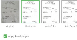  |
colorOnSecondary | light: UIColor.white dark: UIColor.black | Used to tint elements that reside on colorSecondary, like the icon of the capture button. |
colorScanButtonsLayoutBackground | light: UIColor(red: 18/255, green: 18/255, blue: 18/255, alpha: 1) dark: UIColor(red: 18/255, green: 18/255, blue: 18/255, alpha: 1) | Used to tint the background of scan buttons layout.  |
colorScanButtonsForeground | light: UIColor.white dark: UIColor.white | Used to tint the foreground of the scan buttons layout, like the torch button. |
colorScanPolygon | light: UIColor(red: 76/255, green: 175/255, blue: 80/255, alpha: 1) dark: UIColor(red: 76/255, green: 175/255, blue: 80/255, alpha: 1) | Used to tint the polygon overlay which highlights the currently detected document.  |
colorBottomBarBackground | light: UIColor.white dark: UIColor(red: 33/255, green: 33/255, blue: 33/255, alpha: 1) | Used to tint the bottom toolbar background of the image editing page.  |
colorBottomBarForeground | light: UIColor(red: 50/255, green: 50/255, blue: 50/255, alpha: 1) dark: UIColor(red: 190/255, green: 190/255, blue: 190/255, alpha: 1) | Used to tint the buttons within the bottom toolbar of the image editing page. |
colorTopBarBackground | light: UIColor(red: 76/255, green: 175/255, blue: 80/255, alpha: 1) dark: UIColor(red: 42/255, green: 42/255, blue: 42/255, alpha: 1) | Used to tint the top toolbar background.  |
colorTopBarForeground | light: UIColor.white dark: UIColor.white.withAlphaComponent(0.87) | Used to tint the buttons contained in the top toolbar. |
colorTopBarTitle | light: UIColor.white dark: UIColor.white.withAlphaComponent(0.87) | Used to tint the text of the top toolbar title.  |
Dark Mode
The Docutain Scanner SDK for iOS also supports dark mode theming. The process is the same, just define different colors for the night version of your theme. The SDK decides which color to use depending on the device's sytem setting and it will change at runtime, if the device's display mode changes.

Defining a custom theme
In order to alter at least one of the colors mentioned above, you need to set the color using the colorConfig of the DocumentScannerConfiguration.
The following is an example which alters the scan polygon color. Every color has a corresponding method.
let scanConfig = DocumentScannerConfiguration()
scanConfig.colorConfig.setColorScanPolygon(light: .orange, dark: .purple)
UI.scanDocument(scanDelegate: self, scanConfig: scanConfig)