theming
const Home = () => { return ; };
Theming
In order to fit the Docutain Capacitor Scanner SDK into your corporate design, you have a bunch of options to alter the default theme of the ready to use UI components.
Color Theming
The following is a list of all color attributes currently supported.
export interface ColorConfig {
  ColorPrimary?: DocutainColor;
  ColorSecondary?: DocutainColor;
  ColorOnSecondary?: DocutainColor;
  ColorScanButtonsLayoutBackground?: DocutainColor;
  ColorScanButtonsForeground?: DocutainColor;
  ColorScanPolygon?: DocutainColor;
  ColorBottomBarBackground?: DocutainColor;
  ColorBottomBarForeground?: DocutainColor;
  ColorTopBarBackground?: DocutainColor;
  ColorTopBarForeground?: DocutainColor;
}
Detailed explanation
ColorPrimary is used to tint progress indicators and dialog buttons.


ColorSecondary is used to tint selectable controls and the capture button.

ColorOnSecondary is used to tint elements that reside on ColorSecondary, like the icon of the capture button.
ColorScanButtonsLayoutBackground is used to tint the background of the layout containing the buttons of the scan layout, like the capture button or torch button.

ColorScanButtonsForeground is used to tint the foreground of the buttons of the scan layout, like the torch button.
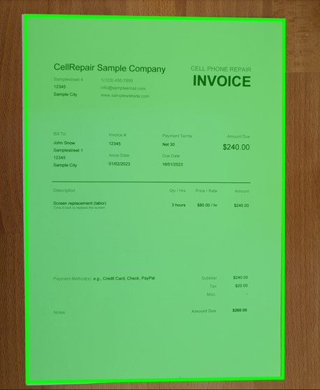
ColorScanPolygon is used to tint the polygon overlay which highlights the currently detected document.
ColorBottomBarBackground is used to tint the bottom toolbar background of the image editing page.

ColorBottomBarForeground is used to tint the buttons within the bottom toolbar of the image editing page.
ColorTopBarBackground is used to tint the top toolbar background.

ColorTopBarForeground is used to tint the elements contained in the top toolbar, like buttons and titles.
Defining a custom theme
In order to alter at least one of the colors mentioned above, you need to pass it to the DocumentScannerConfiguration which is used to start the ready to use UI Scan components.
The following is an example which alters all currently available colors.
import { DocutainSDK } from '@docutain/capacitor-plugin-docutain-sdk'

try{
    const scanConfig: DocumentScannerConfiguration = {
        ColorConfig: {
            ColorTopBarBackground: {
            Light: '#4CAF50',
            Dark: '#2A2A2A'
            },
            ColorBottomBarBackground: {
            Light: '#FFFFFF',
            Dark: '#2A2A2A'
            },
            ColorPrimary: {
            Light: '#4CAF50',
            Dark: '#4CAF50'
            },
            ColorSecondary: {
            Light: '#4CAF50',
            Dark: '#4CAF50'
            },
            ColorOnSecondary: {
            Light: '#FFFFFF',
            Dark: '#000000'
            },
            ColorBottomBarForeground: {
            Light: '#121212',
            Dark: '#DEFFFFFF'
            },
            ColorScanButtonsForeground: {
            Light: '#FFFFFF',
            Dark: '#FFFFFF'
            },
            ColorScanButtonsLayoutBackground: {
            Light: '#121212',
            Dark: '#121212'
            },
            ColorScanPolygon: {
            Light: '#4CAF50',
            Dark: '#4CAF50'
            },
            ColorTopBarForeground: {
            Light: '#FFFFFF',
            Dark: '#DEFFFFFF'
            },
        }
    }
    //start the scanner
    const result = await DocutainSDK.scanDocument({config: scanConfig});
}catch (error) {
    console.error(error);
}
Dark Mode
The Docutain Scanner SDK also supports dark mode theming. This is why each color has a Light and a Dark version.
export interface DocutainColor {
  Light: string;
  Dark: string;
}
The colors will be automatically picked up based on the device setting. If it is currently in dark mode, the Docutain SDK will use the Dark versions of the colors, otherwise it will use the Light versions.

Document Scan Onboarding
If a user opens the document scanner for the first time, an onboarding dialog appears. The displayed image can be customized by setting the onboardingImageSource of the DocumentScannerConfiguration. For Android it needs to be the name of an image in your drawable folder. For iOS it needs to be the name of an image in your assets catalog. In both cases do not include file extension.
import { DocutainSDK } from '@docutain/capacitor-plugin-docutain-sdk'

try{
    const scanConfig: DocumentScannerConfiguration = {
        onboardingImageSource: "your_custom_image"
    }
    const result = await DocutainSDK.scanDocument({config: scanConfig});
}catch (error) {
    console.error(error);
}
If you are using a custom image, you are responsible to test whether the dialog layout is fine.